The building design is supposed to serve both an aesthetic and functional purpose. It may be for a home, a business, or other structures that provide shelter. When you think about cafes, you might be more focused on what the brew of the day is.
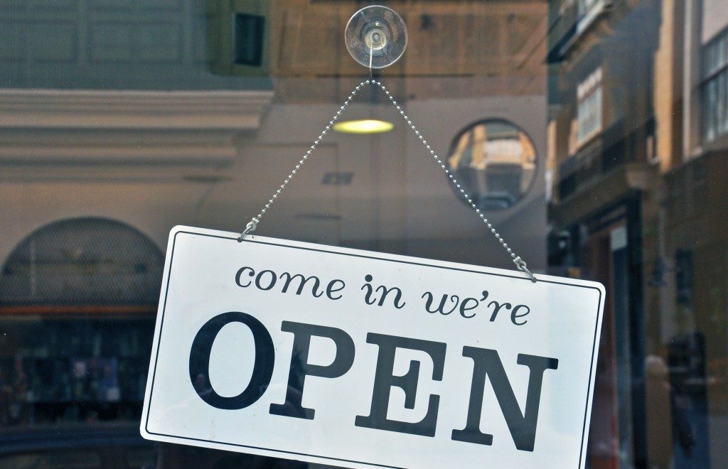
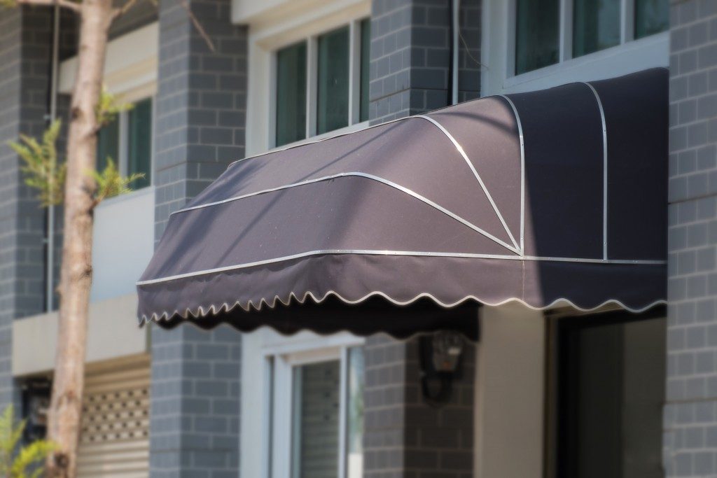
But, if you happen to own one, there are considerations you need to make other than the menu. The building itself is important since this is where your customers will stay and enjoy your sumptuous menu. Its design contributes to whether they’ll come in or bolt out.
The following are a few flaws that you need to avoid when your establishment is on the upstart.
Too Little, Too Much
The size of the property itself may prove to either be your ally or your enemy. For those who experience the latter, it’s usually because of lack of planning. Some people purchase too large a spot and end up wasting space.
A few others buy a property that’s too small to accommodate many customers who want to stay. Working the space that you have to your advantage may not be easy, but it’s important that you do so. Don’t worry, as doing it is feasible with the help of a professional general contractor in Salt Lake City.
Poor Flow and Accessibility
Sometimes, so much attention is given to where the customers will stay that figuring out how people will come in and go out seems like an afterthought. There could be a problem with the path going from the outside to the inside.
The arrangement of the furniture and the different sub-areas could restrict the movement of both customers and staff. Don’t place your stuff wherever you think it would work.
Put the tables that need 3 or more people where they won’t interrupt those who prefer being by themselves. The starting point of service should also be placed in a strategic location to gain little to no disruption.
Poor Light Distribution

Part of interior design is the lighting and how it affects the overall look and experience. Some café owners forget this and either put in too much or too little. Too much brightness can take away the relaxing feel of the place, especially for people with sensitive eyesight.
The lack of such may give your customers the feeling that it’s not a coffee shop but rather, a bar or another similar establishment. Remember to maximize natural lighting by positioning the windows and plan out the distribution of the artificial accordingly. The right combination of the two can set the mood for almost anything and may just get your patrons to order more.
People gather in a certain place because they find that they can have enough privacy or spend time together with their friends and family members who share the same taste. Getting it right with your interior as well as the exterior not only makes them come back for more of that tasty coffee but also for the environment other than home that suits their relaxation and focus needs.

